This was a redesign of the original packaging for Bakon Vodka. I am one of the founders of Black Rock Spirits and designed the initial packaging when we launched.
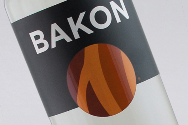
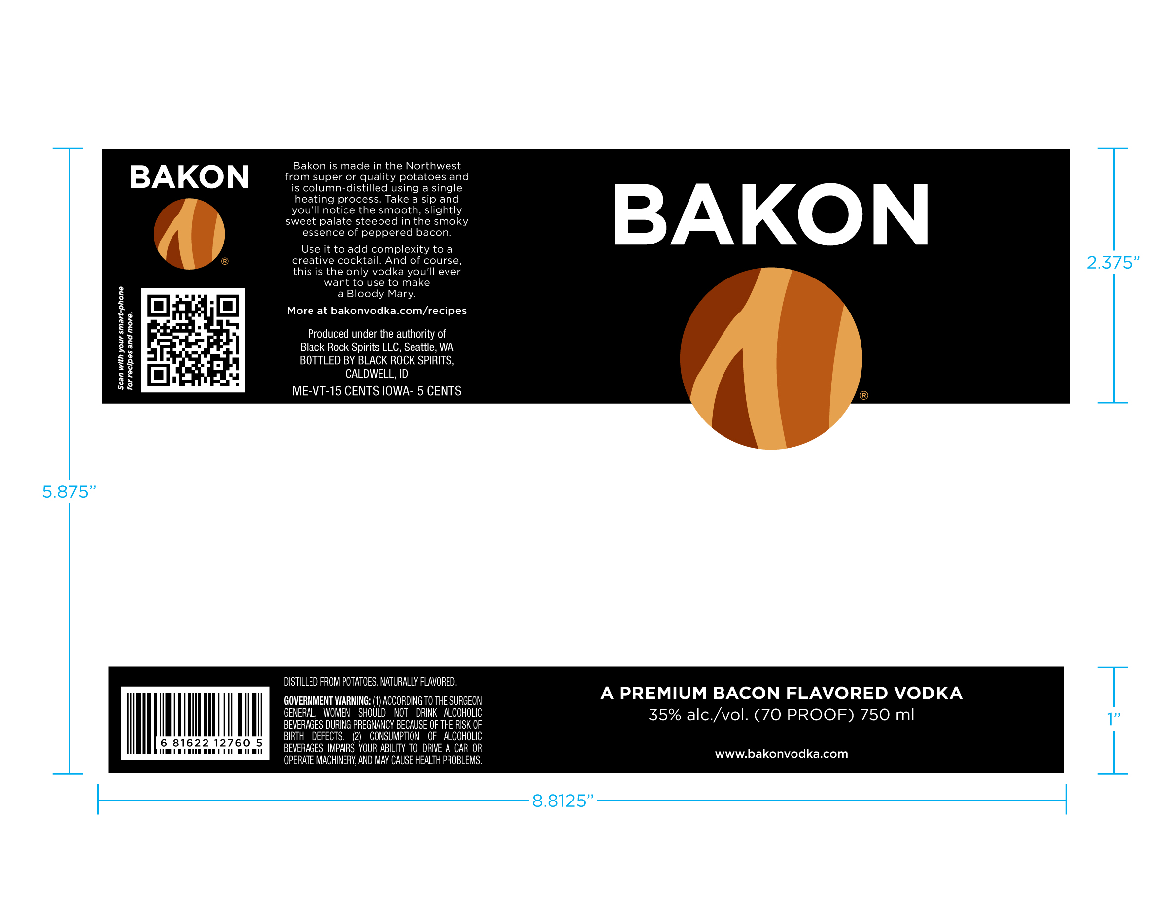
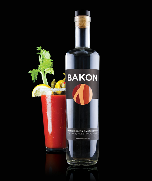
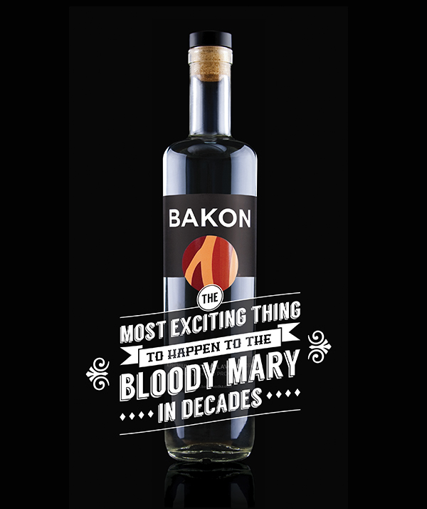
The initial packaging was in a bottle shape that was significantly more expensive, and had a tendency to tip off of shelves. This new design featured a wrap around label with a printed pattern on the inside of the label. The black print is covered with a textured varnish to dull it’s appearance, while the white text and logo badge are spot varnished to create additional pop.
The initial run of 100,000 labels each featured an inline printed unique QR code that when scanned with a smartphone allowed you to play an online game feature. The individual QR feature was eventually dropped in favor of a single QR that directed the user to a static page that could be redirected to new features, recipes, or promotions.